The goal was to design the MVP of TUNet Control Center (TCC) with Network Administrator’s dashboard and corresponding pages so the admin can -
- Identify problems through analytics
- Perform diagnostics
- raise tickets with 3rd party platform
- Search and filter devices
My Contributions
- Field testing
- In-depth interviews
- Information architecture
- Wireframe, Prototype
- Visual design library
Outcome
- 100% completion rate for ‘identification to ticket raise’ task
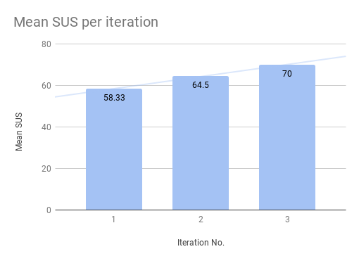
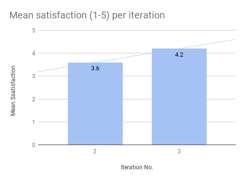
- SUS(70) and Satisfaction(4.2/5) scores suggested good usability
- Raised awareness of design thinking among executives and managers by involving them into user testing.
- Led a group of co-ops to develop a front-end library
Ideation and Strategy
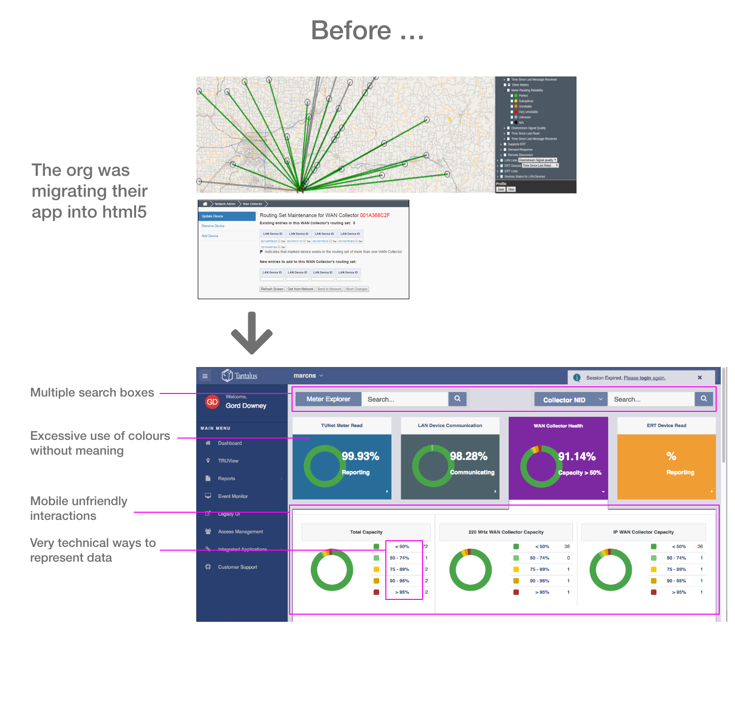
Existing issues
While creating early concepts I tried to address the most obvious problems in the existing interface.
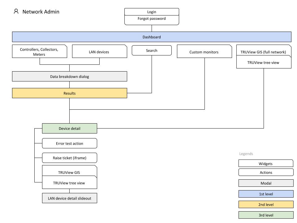
Use cases and Information Architecture
I worked with the product manager and the customer support leads as they understood the existing platform and pain points. I documented the IA and Use Cases that we refined over iterations.
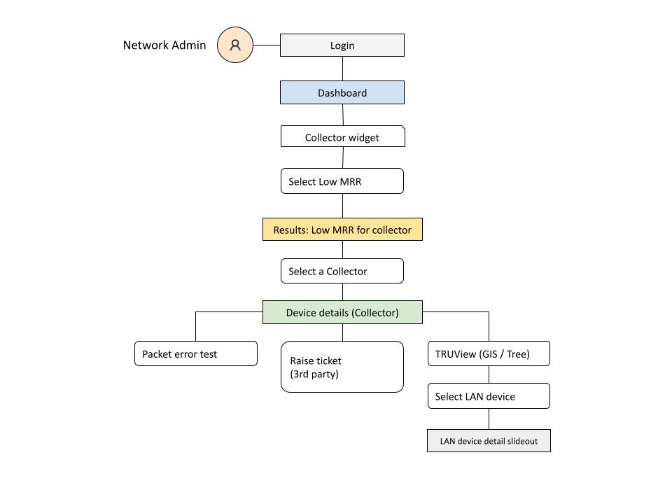
Concept exploration
Early testing and key findings
I tested with 3 external and 3 internal participants in 1st iteration with a mid-fidelity prototype built with Sketch and Invision.
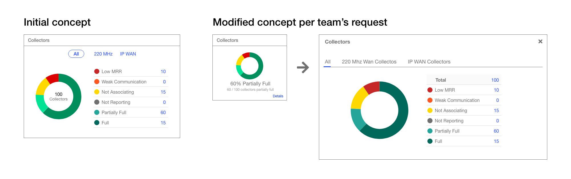
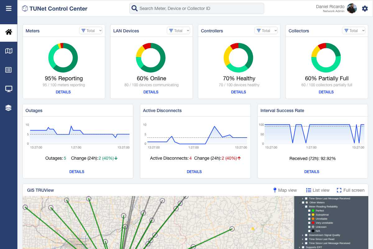
50% of the users clicked on the red section of the donut chart instead of the number of Low MRR. Some of them thought the ‘Low MRR’ text can be clickable though it wasn’t in blue. Making the entire row clickable made more sense at this point.
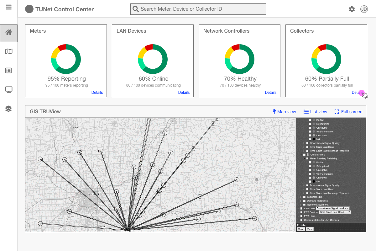
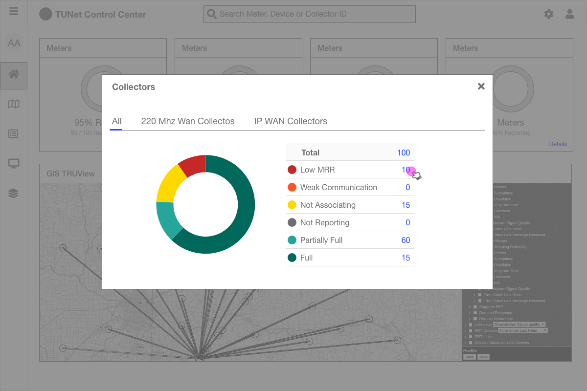
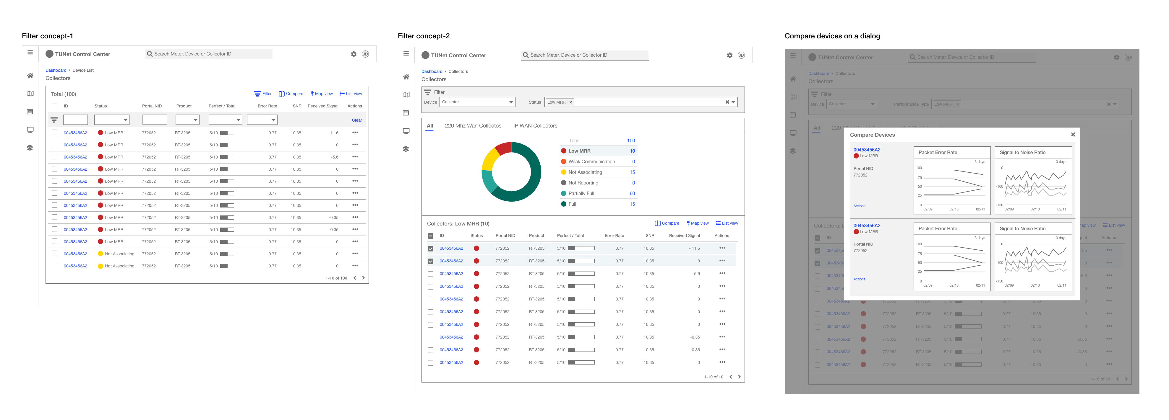
It was only filtering to Low MRR devices. But if the user wanted to view other categories of Collectors they would have to get back to the dashboard, bring out the dialog or click the interactive chart.
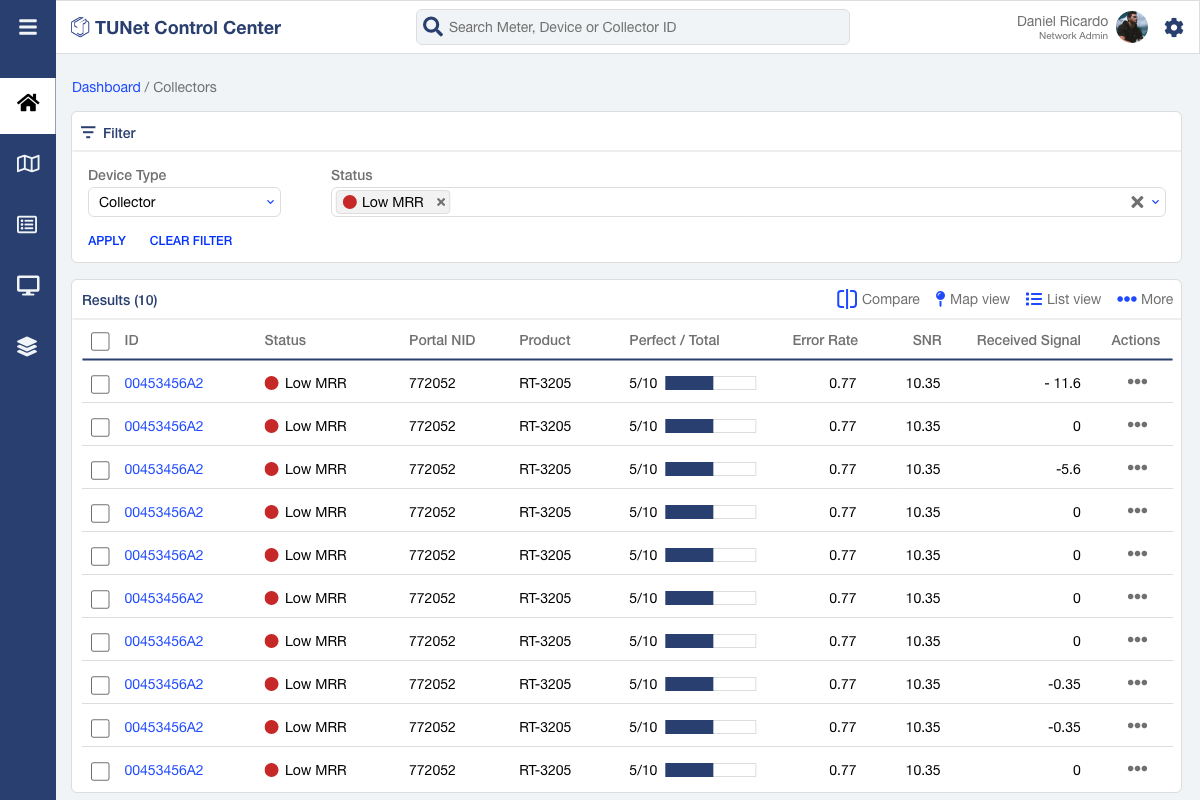
Users were looking for a filter for the datagrid. Also, they wanted to compare devices.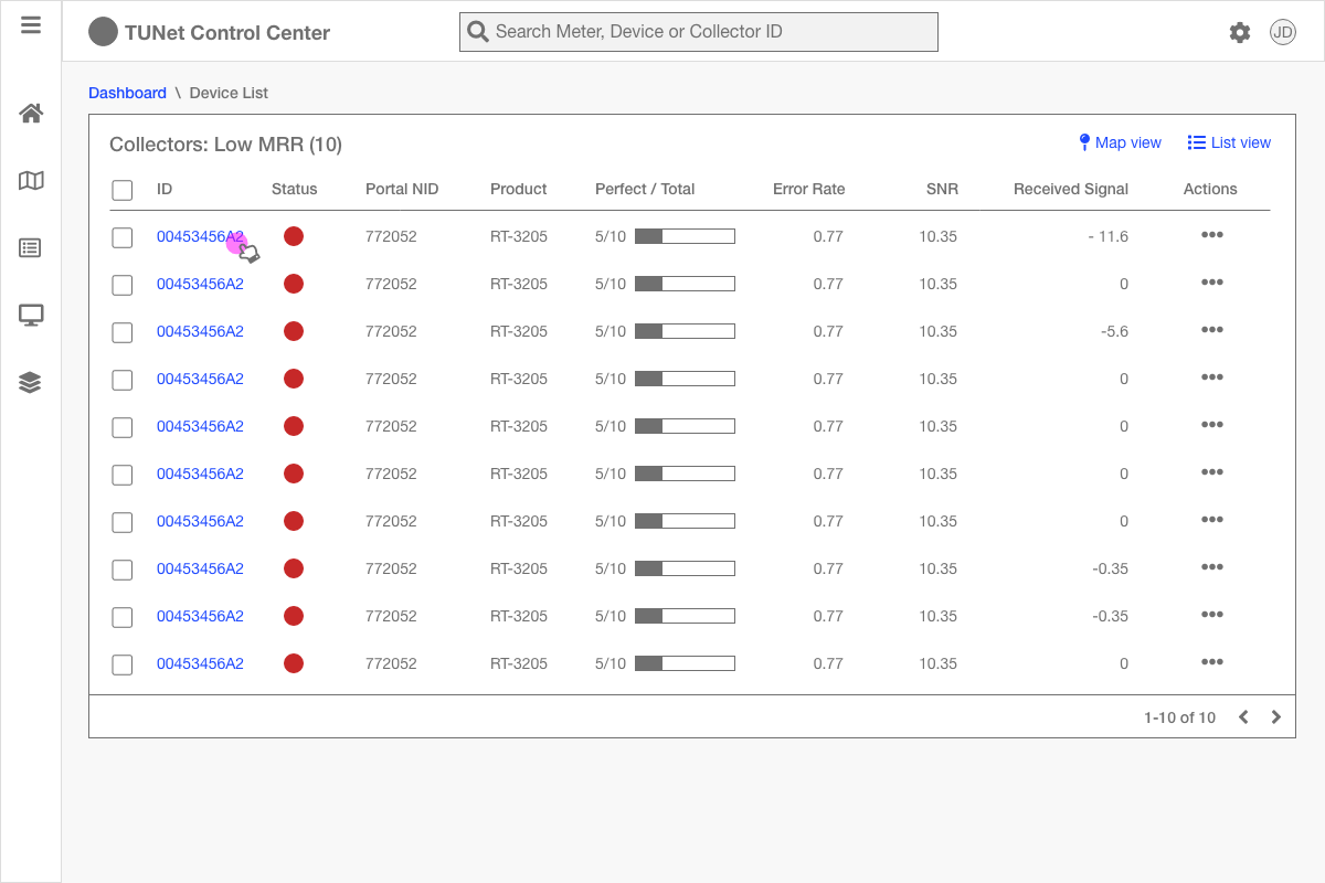
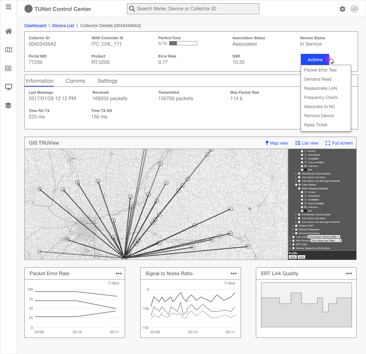
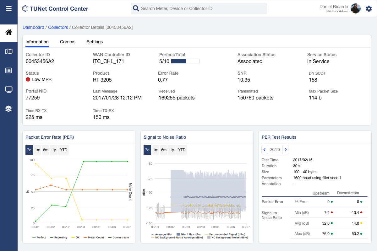
Users cared most about the actions, bottom 3 widgets and TRUView in the details page.
Improvements in 2nd Iteration
In the results page I introduced a filter. Also, I intended to get rid of the dialog invoked by 'Details' action on the cards. Instead, I wanted to bring users to this page when they clicked details.
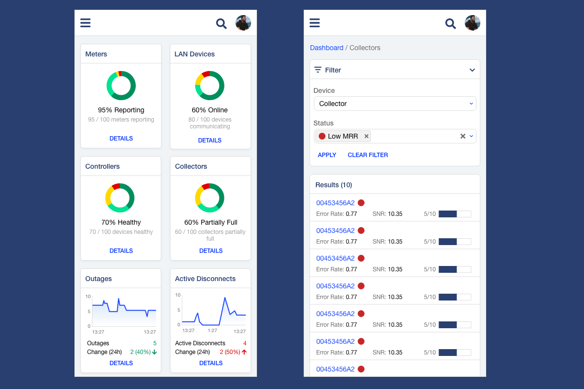
Final Iteration
Visual Designs
I created a design library with modular components with guidelines for colors, typography and common controls.
Improvement in satisfaction
In every iteration of testing I captured System Usability Score (SUS). And, Satisfaction (emoji) for the last 2 iterations. Both showed upward trends.
Challenges
Most users weren’t tech savvy
I went to three locations in the USA with the team to observe and interview the users at their work locations.
These places were a long way from the main city. All users were computer literate but most users were not highly tech savvy. For their work they relied mostly on Tantulus’ training sessions, user guide and customer support.
Not enough usability testing
Number of participants were low and time was a big constraint. For a product of this volume, long-term studies like journey mapping would have really made a difference in usability.